

Apple’s Ecosystem across time: designing for tomorrow - Liquid Glass
ECOSYSTEM THINKING - ARTICLE 2/4

This article is the second of a four-part analysis of the rise of ecosystem thinking in tech:
PART 1 / The rise of ecosystem thinking
PART 2 / Apple’s ecosystem across time: designing for tomorrow - Liquid Glass
PART 3 / Meta’s ecosystem independence: breaking free from smartphones - Wearables
PART 4 / Google’s ecosystem leverage: embedding AI in existing products - Gemini

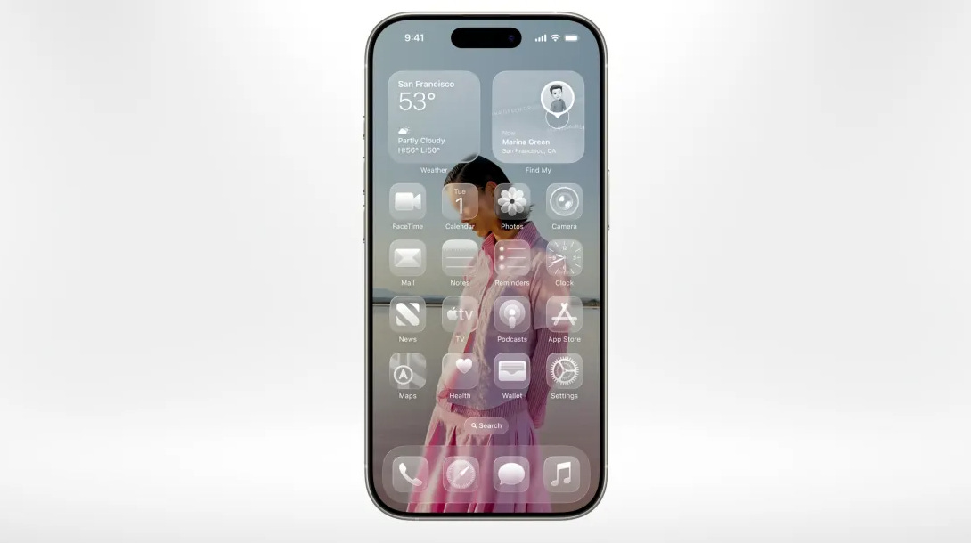
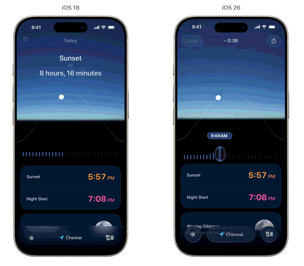
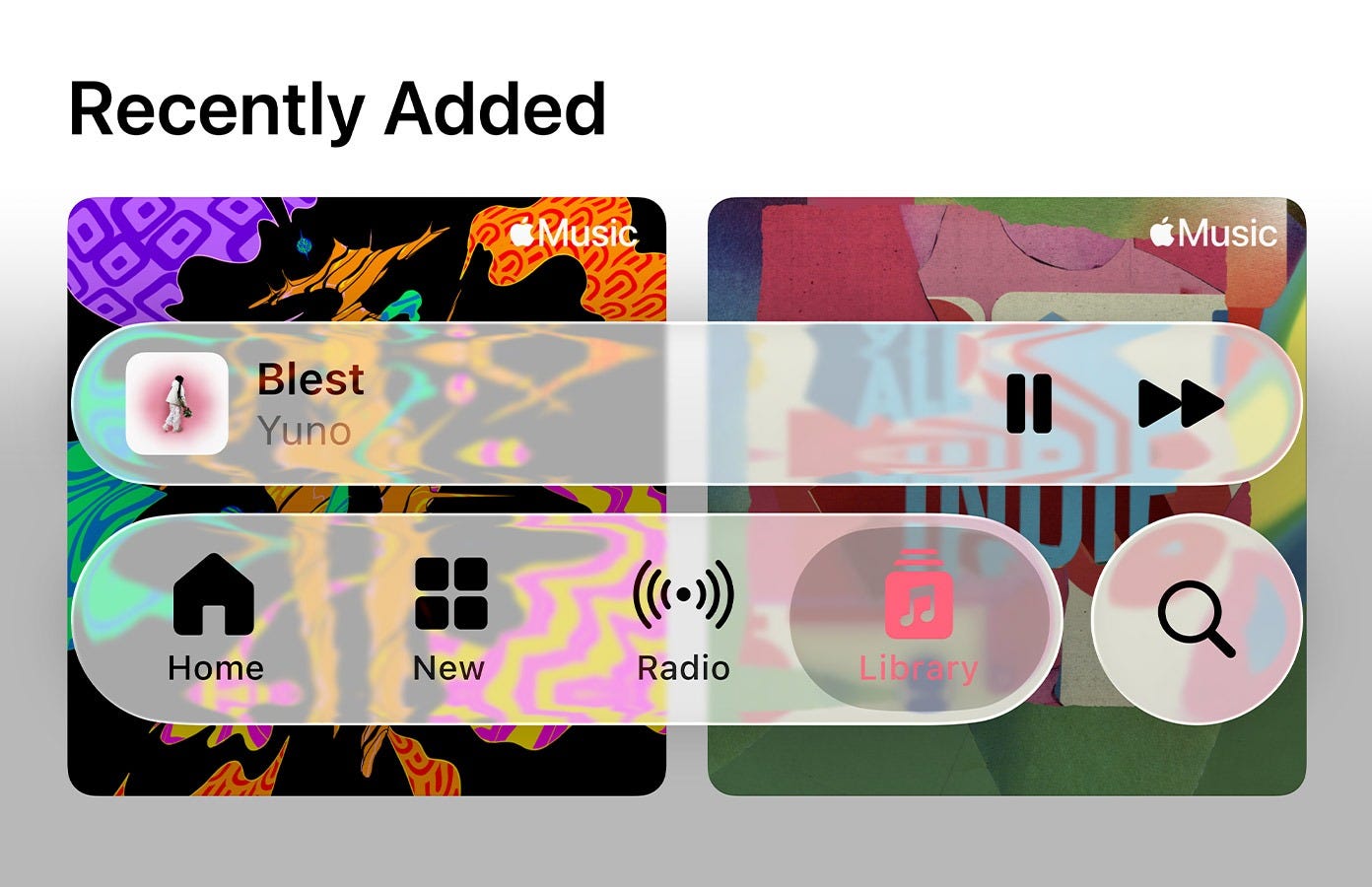
The iOS 26 beta dropped and designers immediately started arguing. Not about whether Liquid Glass looks good (though opinions split hard on that) but about what it means. Because Apple doesn’t do visual updates for aesthetics. The company that removed the headphone jack and killed skeuomorphism doesn’t make interface decisions lightly, and this one degrades usability in ways that violate Apple’s own guidelines.
Nothing CEO Carl Pei posted “I kinda love it?” then went quiet for a beat before adding observations about spatial interfaces. He caught it immediately. Four months after Apple dropped Liquid Glass, the rest of us are still figuring it out.

So, what are we looking at?
Your Twitter feed keeps comparing this to Windows Vista’s Aero glass. That’s wrong, but instructive. Aero was a transparency effect, literal alpha channels revealing content beneath windows. Clever for 2006, but ultimately just layering. Liquid Glass is doing something fundamentally different: simulating how light refracts through curved glass in real-time, on a mobile GPU, at 120Hz.
The background doesn’t just show through, it warps. Content distorts dynamically as UI elements move across it. Apple is rendering actual optical physics, not approximating the look through blur filters. It’s the difference between a photo of glass and glass itself.
And it’s only possible because Apple built the entire stack: custom silicon with unified memory architecture, metal framework optimization, granular OS control over rendering pipelines.
Android manufacturers can screenshot this and send it to their designers. They cannot replicate the execution. By design.

The strategic logic
iOS 7 looked like an aesthetic gamble in 2013. Critics called it trendy, derivative, too minimal. What it actually was: preparation. Apple needed interface architecture that could scale across pixel densities and form factors that didn’t exist yet. Retina displays, multiple screen sizes, the Apple Watch’s tiny canvas: all of it required simplification of visual language. The flat design wasn’t about fashion but infrastructure.
Liquid Glass is the same kind of move, just harder to decode.
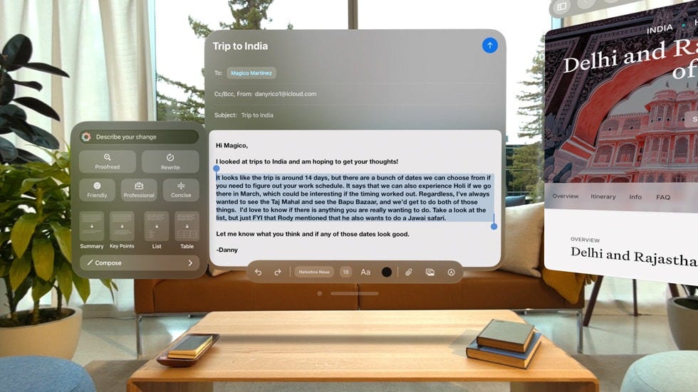
“Liquid Glass design has been the most significant visual overhaul for iOS in years. Apple’s intention with this redesign was to take inspiration from the Vision Pro interface and apply it to all of its operating systems.”
TechCrunch. (2025, September 15). Apple’s iOS 26 with the new Liquid Glass design is now available to everyone.
Remember, Vision Pro shipped with translucent UI, but the physics-based refraction in iOS 26 wasn’t there. VisionOS had frosted glass aesthetics, spatial layering, depth, not shader-driven distortion that simulates real optical physics. That tech got built after Vision Pro launched, which means Apple developed it knowing where it would actually get deployed: not on their $3,500 headset with 200,000 users, but on iPhones reaching 1.5 billion people.

The pattern is consistent: Apple introduces interaction paradigms on familiar devices before new form factors require them.
Multi-touch on iPhone, then iPad. Retina rendering, then Apple Watch. We are now reading through refractive, semi-transparent layers on phones, before AR glasses make it mandatory.

Carl Pei recognized it immediately, his reaction wasn’t aesthetic judgment but strategic recognition. When digital interfaces exist in physical space, they can’t maintain hard edges, they have to blend, refract, behave like partially-occluding layers your brain can parse without conscious effort. That’s not intuitive now. It will need to be intuitive when Apple ships glasses.
My educated guess? Liquid Glass is habituation at scale.

The long game
Hardware specs converged years ago. Android flagships match iPhone cameras, processing power, display quality. Industrial design gets cloned within quarters. So differentiation moves to what can’t be copied: experiences that only work inside Apple’s integrated stack.
Liquid Glass requires shader computations, frame-rate consistency, and battery efficiency that Android manufacturers can’t match without controlling silicon, OS, and framework optimization simultaneously. Competitors can mock up the aesthetic, sure, but they can’t ship the execution without gutting battery life or dropping frames. That gap becomes structural, not temporary.
This is lock-in through feel: when cameras are comparable and chip differences are marginal, visceral UI feedback becomes the differentiator. Users who grow accustomed to how Liquid Glass refracts don’t just prefer it: they can’t take that muscle memory elsewhere.

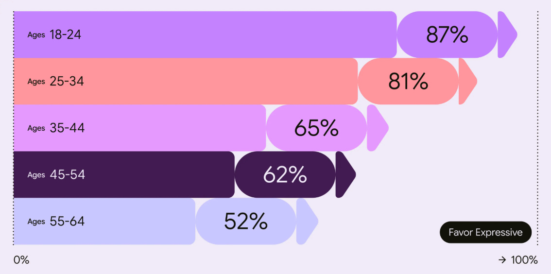
Meanwhile, Google went the opposite direction. Material Design 3 is built on accessibility research: 46 studies, 18,000+ participants, empirical proof that older users spot UI elements four times faster with higher contrast and defined boundaries. It’s a toolkit optimized for human visual perception as it exists.

Apple is optimizing for perception that doesn’t exist yet.
Sacrificing readability today for interaction paradigms that might matter in five years. It’s audacious. Possibly arrogant. And it reveals what Apple thinks the stakes actually are: not incremental improvement of current interfaces, but conditioning users for a platform transition no one else is preparing for.
Apple systematically deprioritizes short-term satisfaction when building toward strategic futures.
Remember the headphone jack removal? Mocked relentlessly, then wireless audio became ubiquitous within two years. Current users might find Liquid Glass distracting, but 18 months from now when AR glasses ship, these same people will instinctively understand reading through refractive surfaces. They’ll have been doing it daily. Behavioral conditioning as aesthetic evolution.

A messy reception
The response broke into three camps, each technically correct.
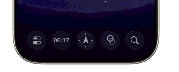
Accessibility researchers and UX practitioners flagged immediate problems: contrast ratios below standards, readability issues, mental processing load from background motion and transparency. They’re right on the biology. Edge contrast detection happens in your retina before your brain gets involved, so excessive transparency creates cognitive overhead that habituation can’t eliminate: the Control Center is functionally degraded.
The car window analogy stuck because it’s accurate: reading text through transparent glass is objectively harder. Optical physics don’t care about adaptation.
Designers focused elsewhere: on execution.
Shader precision, how refraction responds to wallpaper variations, the computational ambition of deploying this across the install base. Their argument: innovation means accepting rough first versions. iOS 7 got hammered for legibility problems before Apple refined it. Liquid Glass might follow the same arc.
A smallest group sees strategic positioning. They’re watching Apple optimize for 2030, not 2025, and recognizing that short-term usability sacrifice for long-term platform preparation is standard operating procedure.

The accessibility problem
Apple’s accessibility reputation was earned: industry-leading assistive technology, inclusive design principles, guidelines that raised standards across the industry. Liquid Glass undermines that.
The low contrast between transparent UI and dynamic backgrounds isn’t just aesthetically contentious: it creates real barriers for users with visual impairments. The motion and refraction trigger genuine discomfort. Some users report motion sickness Not subjective taste, but functional degradation for a significant user population.
Anticipating the critique, Apple has a “Reduce Transparency” toggle to maintain regulatory compliance. But framing accessibility as opt-in represents a philosophical shift. The default prioritizes aesthetic ambition over inclusive design. Legal requirements in the US and EU mandate contrast ratios, Apple meets them through settings toggles. Technically compliant, philosophically different.

Two readings: Apple assumes most users won’t enable accessibility features, allowing them to ship their desired aesthetic while staying legally clear. Or: Apple believes the majority will adapt, and customization adequately serves those with specific needs. Either interpretation represents departure from designing defaults that work for everyone.

Technical excellence vs. functional utility
The execution is exceptional. No question. Building Liquid Glass required expertise most organizations can’t assemble: GPU programming, optical physics, visual design, systems integration.
But craft doesn’t justify design. We ask ourselves, does refractive distortion serve functional purpose, or exist because it’s technically achievable?
Even accepting that future interfaces might blend digital and physical layers, why assume that requires reduced readability? Eye-tracking could adjust focus. Background masking could preserve contrast. Higher-opacity overlays could maintain hierarchy. The idea that transparent, refractive UI is necessary rather than chosen isn’t obvious.

What does that tell us about Apple’s positioning?
In my opinion, three things become clear from what Apple shipped.

They’re willing to iterate publicly now. The beta’s Control Center is functionally degraded, suggesting Apple will ship rough v1s and refine in public. That’s different from multi-year refinement cycles. Either confidence users will tolerate it, or competitive pressure forcing faster iteration.

They’re building on a different timeline. Competitors are focused on foldables, stylus tech aka current generation improvements. Apple’s betting spatial computing replaces or augments smartphones in 5-7 years. Long-term positioning from a market leader, not quarterly optimization.
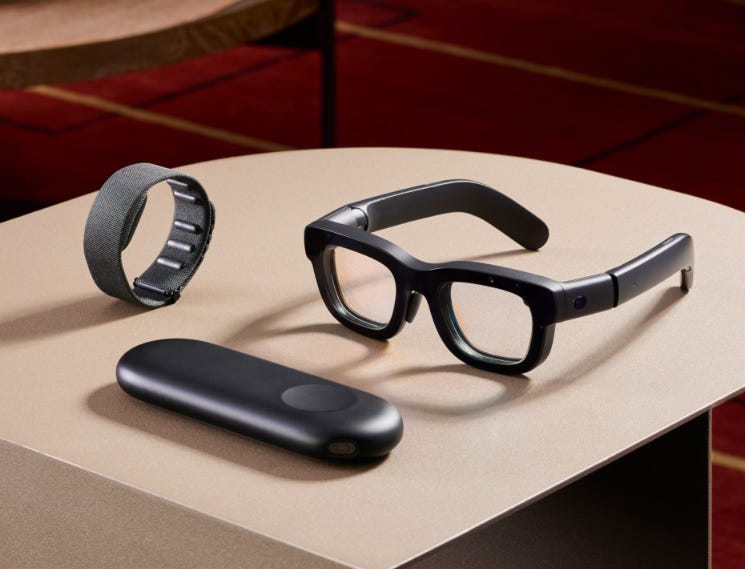
Interestingly, Meta is making similar bets: Orion glasses with compute pucks, Neural Bands for gesture control, peer-to-peer device ecosystems instead of phone-centric architecture. We’re witnessing the industry’s splitting: some of the major players betting on platform transitions, everyone else optimizing present form factors.

And lock-in through technical moats. Liquid Glass can’t be replicated outside Apple’s integrated stack. Users develop attachment to specific UI behaviors that become switching costs. Ecosystem strategy as aesthetic evolution.

What happens next?
Most likely: Apple refines iteratively.
Better contrast, adjusted motion curves, increased blur where needed, core paradigm intact. By iOS 27, it’s polished enough that users accept it as standard (iOS 7 followed this path).
Possible: partial retreat.
Accessibility and usability backlash forces Liquid Glass toward opt-in. Lock screen and widgets keep it, system UI returns to higher contrast. Rare Apple admission of overreach, though they’d call it responsiveness.
The bet: AR vindication.
Glasses ship 2026-2027 requiring the visual parsing Liquid Glass trained. Users who struggled suddenly understand the purpose. Design validated retroactively as visionary. This is what Apple is counting on.

A future of distinction by design
The attempt is bold: preparing hundreds of millions of users for a platform transition that hasn’t occurred, betting usability sacrifice now pays strategic dividends later. The execution demonstrates vertical integration advantages and physics-first interface thinking.
But it falls short of Apple’s standard: making complexity feel effortless. Low contrast, excessive transparency, visual distraction indicate either rushed development or miscalculation about user tolerance for degraded usability.
The accessibility compromise is most concerning. Apple led the industry in inclusive design. Retreating from that, even with opt-out mechanisms, objectively contradicts the principle that good design serves everyone by default, without requiring special accommodations.

Yet this might validate a broader thesis about where differentiation now lives. When AI democratizes interface creation (when anyone can prompt functional UI into existence) brand leaders distinguish themselves through design choices that couldn’t be prompted. Choices requiring conviction, risk tolerance, strategic vision.
548 companies worldwide now have Chief Design Officer positions, with design becoming “a strategic force” providing “imagination, creativity, and new problem-solving approaches crucial for success.” When 45% of executives cite “creative originality and strategic thinking” as the most critical differentiator, design decisions shape business strategy rather than merely executing it.
Liquid Glass fits this pattern: not safe iteration, design-led conviction, the kind that only happens when design has genuine C-suite influence.