

A designer’s guide to healthcare software
Design principles for environments where failure has consequences


If you’re designing for healthcare, you’re working in an environment where three conditions converge:
users can’t leave,
errors have serious consequences,
and real-world conditions differ drastically from testing environments.
The same constraints apply to autonomous vehicles, financial trading platforms, and industrial control systems. Consumer product patterns don’t transfer.
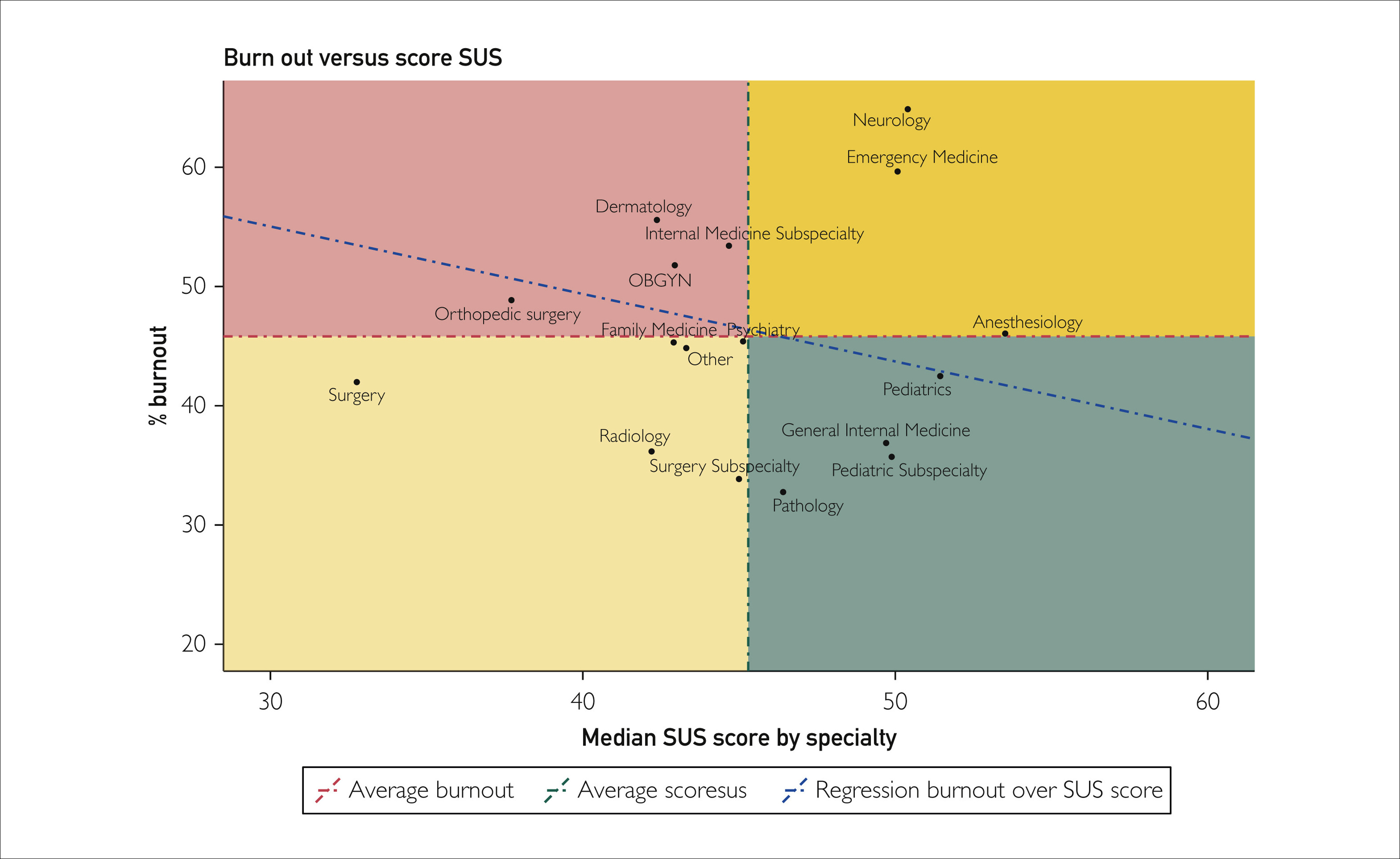
Physicians rate Electronic Health Record systems at 45.9 out of 100 on the System Usability Scale, placing healthcare software in the bottom 9% of all products across industries. Nurses score their systems at 57.6. These F-grade products contribute to over 30% of medication-related safety events and correlate directly with burnout rates exceeding 50% among clinicians.
The market opportunity is real. AI integration could unlock $360 billion in healthcare efficiency, with early adopters seeing 50% reductions in documentation time and 70% decreases in burnout. Hospital AI adoption doubled from 16% to 31% in a single year. Capturing this requires understanding why standard design thinking fails under constraint, and what actually works when stakes are high.
Why consumer patterns fail under constraint
Consumer software optimizes for engagement and seamless flow. Healthcare inverts this completely. Users are retained by default.
Consumer software optimizes for engagement and seamless flow. The entire B2C product playbook focuses on retention: making users stay, reducing friction to prevent abandonment, optimizing for habitual use. Healthcare inverts this completely. Users are retained by default. Doctors and nurses can’t quit the software mid-shift. They’re contractually obligated to use whatever their hospital bought. What consumer products spend millions trying to achieve (users who can’t easily leave) is the baseline condition in healthcare.
This inversion reshapes design priorities. When retention is guaranteed, there’s no competitive pressure to optimize for user satisfaction. The people suffering through poor design can’t vote with their feet. The people buying the software (hospital IT and administration) aren’t the ones using it daily. Implementation costs run into hundreds of millions, making switching nearly impossible.
Clinicians access six different screens per patient, toggling between systems requiring hundreds to thousands of clicks for routine workflows. An ICU adds 1,348 data items per patient per day. Clinicians face 100 to 200 alerts daily. As alert volume increases, acceptance rates decrease, creating dangerous desensitization. One study found 25% of drug alerts and one-third of clinical reminders were duplicates, training clinicians to ignore potentially life-saving warnings.
Progressive disclosure and just-in-time information don’t work here. When a patient crashes, vital signs, medications, and allergies need immediate visibility without scrolling or clicking. Your information architecture that tests beautifully becomes a barrier to critical care under real-world pressure.
Systems must simultaneously serve experts moving at maximum speed and less experienced staff who need guidance, all while maintaining safety guardrails that prevent catastrophic errors without creating the alert fatigue that makes those guardrails ineffective. There’s no consumer product equivalent.
The market dynamics that keep bad design profitable
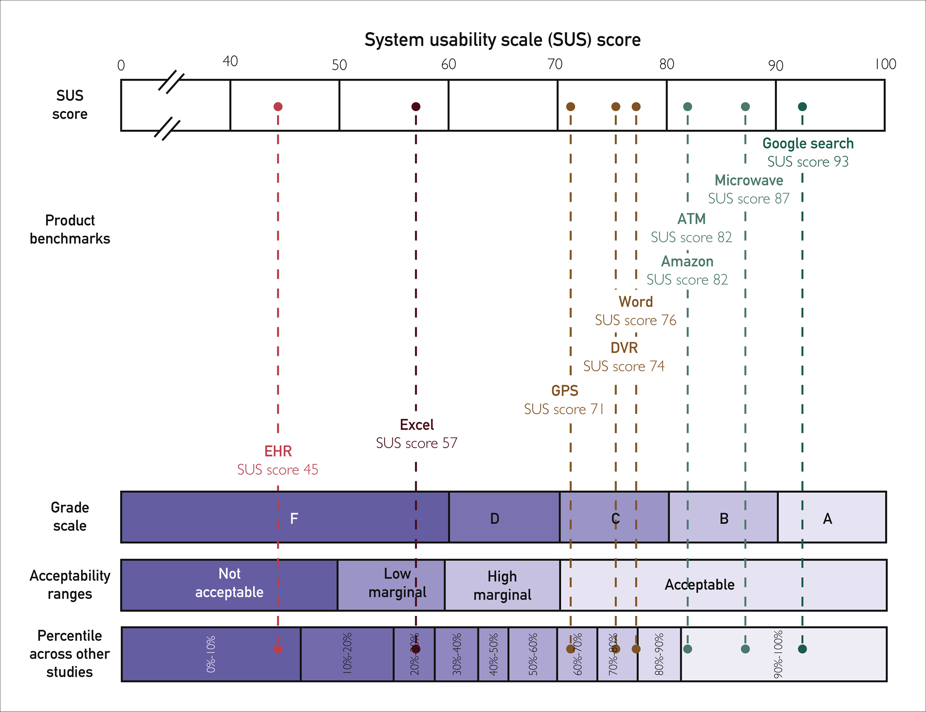
The 30-point gap between vendor-reported usability scores (around 75) and real-world physician scores (45.9) comes from misaligned incentives. Vendors test with controlled scenarios and cherry-picked users. Healthcare organizations can’t easily switch systems once deployed. Implementation costs run into hundreds of millions. Doctors and nurses can’t abandon poorly designed software; they’re contractually obligated to use whatever their hospital bought.
The people suffering through the software aren’t the people buying it. Switching costs are so high that major usability problems years after deployment don’t necessarily trigger replacement.
This dynamic exists wherever enterprise software operates with high switching costs and split decision-makers. The burnout crisis is changing the calculation only because turnover costs ($56,300 per nurse, $500,000 to $1 million per physician) make poor usability a C-suite problem. When exit interviews cite software burden as a primary driver, that usability gap represents quantifiable financial risk.
AI offers something rare in enterprise software: alignment of incentives. Clinicians get documentation time reduction and improved work-life balance. Hospitals get better retention, higher throughput, and reduced malpractice risk.

Case study: success
UTHealth Houston achieved a 97th percentile Net EHR Experience Score despite implementing Epic during the COVID-19 pandemic. They treated implementation as continuous process rather than one-time event, tracking user efficiency data systematically to identify specific workflow bottlenecks. When they discovered clinicians losing time in particular interactions, they targeted those friction points with precision.
They invested in expert-led training focused on efficient usage patterns, acknowledging that research shows minimum four hours for effective EHR training, with quality mattering more than duration. Most critically, they established feedback loops persisting beyond go-live. Healthcare implementations fail most often not during testing but months later when real-world complexity overwhelms carefully designed workflows.
MaineHealth took a different approach with similar results: giving nurses agency in the optimization process. Rather than treating frontline users as subjects of change management, they positioned them as drivers of it.
Their success came from treating design as ongoing negotiation with reality, not a spec to be executed.

Case study: fails
Interestingly, Epic holds 38% of hospital installations with over 40 years of institutional knowledge. It worked in our Houston example, so their implementations in Denmark (2016 to 2017) and Finland (2018 to 2022) should have been straightforward execution. It was not.
Five years after Denmark’s go-live, 32% of users remained dissatisfied. Time to complete common clinical tasks increased rather than decreased. In Finland, only 4.7% of physicians and 7.3% of nurses agreed patient information was easy to access.
Epic’s software embeds American healthcare workflows and terminology at deep architectural levels. The localization effort underestimated how much workflow patterns are baked into system design, not just in obvious places like form layouts, but in information architecture, navigation patterns, and the sequence of clinical tasks.
You can translate the interface and still have software that fights users at every interaction.
Denmark’s physician builder program struggled to balance standardization and flexibility. Give every department customization rights and you create chaos. Enforce too much central control and you alienate users. Post-deployment customization can’t fix workflow misalignment at the architectural level.
Design principles that work under constraint
These principles transfer directly to other high-stakes domains.

Information hierarchy becomes non-negotiable.
Royal Children’s Hospital Melbourne’s mobile nursing implementation put vital signs, active medications, and allergies in a fixed header that persisted across all screens. No scrolling. No navigation. No dropdown menus. Critical information claimed screen real estate permanently because when a patient codes, those three seconds you save by not clicking matter. Compare this to typical EHR implementations that bury allergies in a patient summary tab, behind a medications accordion, requiring clinicians to remember to check rather than seeing it unavoidably.


Consistency becomes a safety feature through muscle memory.
Denmark’s Epic implementation changed how medication order frequencies appeared in dropdown menus. A clinician selected the wrong frequency because the order had shifted. Same screen, same workflow, different sequence. The error wasn’t lack of attention. The interface trained the user to expect consistency, then violated it. In high-stress environments, your brain relies on automaticity. Novel interaction patterns that would differentiate a consumer app become vectors for fatal mistakes in healthcare.

Error prevention means structural constraints, not warnings.
Denmark’s Epic implementation made it possible to swap height and weight in data entry fields. The system would accept 180 kg for a height field without questioning it. No dropdown forcing unit selection. No validation checking if the value made physiological sense. Better error messages or confirmation dialogs wouldn’t have helped. The data model needed restructuring so impossible entries couldn’t be constructed. When a silently removed decimal point can turn a 2.5mg prescription into 25mg, you can’t rely on the user catching it.


Alert intelligence through radical suppression.
Cleveland Clinic didn’t optimize their sepsis alerts by making them prettier or more prominent. They achieved a ten-fold reduction in false positives by tightening the criteria for when an alert fires. Instead of alerting on any two sepsis indicators, the system required three indicators plus specific vital sign thresholds plus lab value trends. Fewer alerts, 46% more actual sepsis cases identified. The alerts worked because clinicians started trusting them again. When you see 200 alerts daily, your brain learns to ignore them all. When you see two alerts weekly and they’re almost always right, you pay attention.


Designing for interruption means visible state everywhere.
Most healthcare software assumes you’ll complete a task in one session. Reality: a physician starts a prescription order, gets paged about a deteriorating patient, spends 20 minutes stabilizing them, then returns to discover their incomplete order is gone. Auto-save helps, but better is showing incomplete work prominently. Color-code partially completed orders. Maintain a persistent drafts panel. Make it impossible to forget what you didn’t finish. Context switching isn’t an edge case; it’s the primary use case.

The AI shift and strategic positioning
Ambient clinical intelligence removes the computer from between clinician and patient. Microsoft’s Nuance DAX Copilot leads at 33% market share, with unicorns Abridge (30%) and Ambience (13%) growing rapidly. They’re restructuring the interaction model rather than adding features to existing workflows.
Oracle’s August 2025 launch of a voice-first EHR signals market direction. Rather than bolting AI onto legacy architecture, they rebuilt the entire system around voice interaction. Oracle can’t win by being slightly better at Epic’s game, so they’re changing the game entirely.
Epic’s response shows how market leaders approach disruption. They’re integrating 100+ AI features while building an AI Trust and Assurance Suite for local validation and continuous monitoring. Accept near-term cannibalization of your own products to establish position in the next platform.
Companies positioning themselves as integration layers between clinicians and existing EHRs are playing the classic disruption playbook.
They don’t need to replace the entrenched system of record. They become the system of work that sits on top, then expand horizontally into adjacent functions and eventually move down-stack to challenge the underlying platform.

Applying these principles beyond healthcare
Autonomous vehicles face identical constraints: drivers can’t easily quit the software while moving at highway speeds, interface errors can cause accidents. Testing in controlled environments (sunny California days) doesn’t predict performance in reality (Boston snowstorms at night). Critical information must be instantly accessible, consistency prevents fatal errors, and the system must handle constant interruption (changing traffic, weather, road conditions).
Financial trading platforms operate under the same pressures: traders can’t abandon positions mid-execution, a misplaced decimal or confusing interface costs millions. And demo environments with clean test data don’t capture the chaos of market volatility.
Information hierarchy becomes non-negotiable, error prevention must be structural, and alert fatigue from excessive warnings creates dangerous desensitization.
The vendor testing gap exists everywhere software meets messy reality. Healthcare makes this visible through safety event tracking. Most industries don’t measure the gap as rigorously, but the 30-point difference between vendor demos (75) and real-world use (45.9) represents a pattern that’s replicable in any domain with high switching costs.
The difference between the Houston implementation and Denmark’s wasn’t better user research or more testing. Instead it was treating design as ongoing negotiation with reality rather than a spec to execute once.

Designing for interruption, maintaining information density without cognitive overload, building structural error prevention instead of relying on warnings. In healthcare, and everywhere you create high-stakes design, the principles remain constant: users can’t leave, errors matter, and testing environments don’t capture reality. Learn to design within these constraints, and you’re building expertise that transfers to every critical system that is deployed into the world.