



AI Key Takeaways
AI creates generic, minimalist designs that can make digital interfaces feel forgettable and indistinguishable from one another.
Minimalism no longer serves as a reliable marker of good taste because AI can now generate clean, professional-looking layouts instantly.
Industry leaders are shifting toward bold, expressive design languages to ensure their products stand out as intentional human choices.
Designers must now prioritize opinionated and unmistakably unique styles to differentiate their work from automated defaults.
Generate a website with AI and you already know what you’ll get. Lots of white space. A thin sans-serif. A soft gradient. Rounded cards in a tidy grid. It will be clean, balanced, and completely forgettable. It looks professional, which is exactly the problem, because so does everyone else’s.
For two decades, minimalism signaled taste. Stripping a thing down to its essentials took restraint and judgment, and the clean result told you a careful person had been there. That signal worked because not everyone could produce it. Now everyone can. The machine produces it by default, instantly, for free.
Minimalism stopped being evidence of taste the moment it became the path of least resistance for a model trained on the average of everything.
Simplicity is the ultimate sophistication. It takes a lot of hard work to make something simple, to truly understand the underlying challenges and come up with elegant solutions. [...] It’s not just minimalism or the absence of clutter. It involves digging through the depth of complexity. To be truly simple, you have to go really deep. [...] You have to deeply understand the essence of a product in order to be able to get rid of the parts that are not essential.
- Steve Jobs
This is the trap I described before. When every output clears the same minimum bar of clean-and-professional, the bar stops telling anyone anything. A non-expert looking at your restrained, considered interface and a generated template sees two clean layouts. They can’t feel the difference, so to them there isn’t one. Your good taste has gone invisible, because it now looks like the floor.
The people who lead design at the top have noticed, and their answer is to get loud.
“The entire tech world started to shift towards minimalism and this very essential design aesthetic inspired by this mantra form follow function. I’m proposing a new formula that evolves from form follow function to form and function follow meaning.”
— Mauro Porcini (Chief Design Officer, Samsung), PrintMag: Design Matters
Mauro Porcini, now Samsung’s first Chief Design Officer, says it plainly: the tech industry should abandon minimalism for a more expressive design language. He points to fashion, cars, and architecture, where people expect personality and variety and are drawn toward complexity rather than away from it. Google made the same move with Material 3 Expressive, its most heavily researched design update ever, built around bold color, shape, and motion. Its own design lead told Dezeen that user testing found an appetite for interfaces that were “wild and way-too-playful.” Apple shipped Liquid Glass this year, a heavy, computationally expensive material that nobody could mistake for a default. None of these are safe choices. That is the point of them.
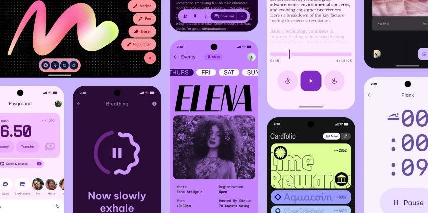
The strategy underneath is the one my whole argument keeps circling. Distinctiveness only counts when an untrained eye can register it as a decision. Expressive, opinionated, slightly divisive design reads as something a person chose on purpose. Clean and minimal no longer reads that way, because the machine got there first and does it for nothing. So you don’t escape the automated sameness by refining the default into a more tasteful version of itself. You escape it by making something loud enough that no model would have produced it.
“Now, UX patterns are well established, digital interactions are second nature, and our devices are seen less as productivity tools and more as extensions of ourselves. Our interfaces can express more dimensions of human experience. “
- Vaness Cho, Google Design vice-president, Deezen.com
This is uncomfortable for a generation of designers raised to revere restraint. Restraint was the whole aesthetic, the mark of someone who knew what to leave out. But restraint and the machine’s output now occupy the same visual space, and when you share a look with the free option, you lose. Being a little better than the template is worth nothing if the people paying can’t see the gap. You have to be unmistakable.
That is the real meaning of the expressive turn. Calling it a fashion swing back toward maximalism misses what’s driving it. The push is a survival response to a market where adequacy is automated and the only legible value is obvious, opinionated difference. Whoever wins the next few years will be making work no model would dare to produce.
NA: AI-assisted tools were used for transcription, reference formatting, and language editing. All intellectual content and conclusions remain solely the author’s.